
Color combination table in the interior: why is it needed and interesting examples of use
Choosing the right color palette is essential when decorating any space. So we will talk about the ways of combining colors in the interior and about the influence of color on a person's mood. Let's also see how the color combination table in the interior can help in self-planning the design of the room.
The color scheme is an important component of any interior.
The content of the article [Hide]
Color combination table in the interior: what is it used for
It is necessary to know not only the meanings of each shade, it is important to be able to correctly combine tones. To apply optimal color combinations in the interior, a color wheel and a design table are used.
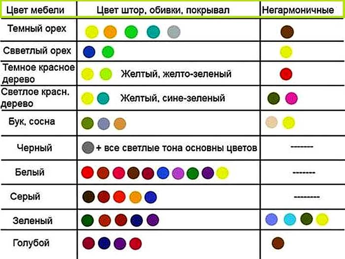
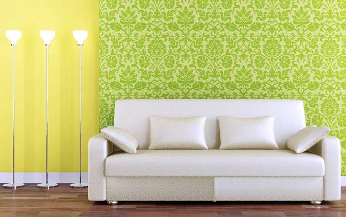
Combination options for furniture and textile accessories
Before learning about the options for combining shades, let's find out about their meanings in our life. Psychologists believe that they can have an impact on our mood and even emotional state.
The color that gives a cheerful mood and warms with warmth is yellow. Green is considered the color of vigor, freshness and health. Lilac tones symbolize renewal, while blue has soothing properties. Orange is ideal for the living room as it symbolizes joy and cheerfulness.
You should not use a significant amount of brown tones when decorating a room, only in combination with others, as it causes depression. Do not abuse and red, which is exciting. Light grayish tones are more suitable for an office, as they denote composure and severity.
The designers presented and formulated several concepts related to shade combinations. The table here has been created with standard usage of the palette in mind.

The table will help you choose the right shades
You can use the following combinations:
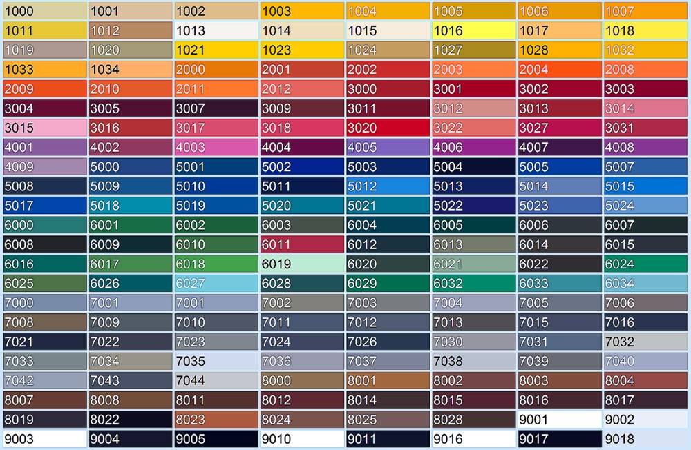
Stretching palette for interior applications
When working on a solution, don't forget about incongruous colors. Black and purple do not look at all, such a tandem will only visually reduce the space. It is tasteless to combine burgundy with dark green. You can't use gray with orange and green. Milky and beige shades do not suit black at all.
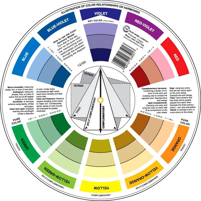
What is a color wheel?
In addition to the color combination table, a color wheel is used in the interior. With its help, the most suitable solutions are selected. The circuit is divided into two components - cold and warm. The latter option includes shades such as yellow, brick or orange. And the coldest part is blue, purple and green.
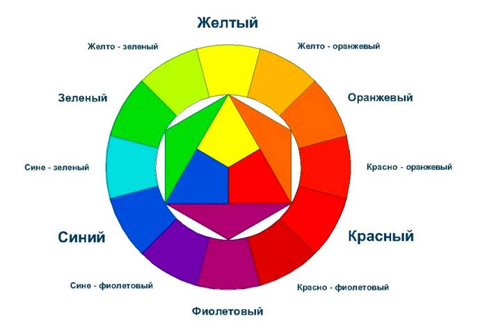
Circle for determining compatibility in a setting
There are 10 variations in the circle. The main group colors are red, yellow and blue.
Application features
Three approaches to perfect color matching
The color combination table in the interior is based on three important approaches to combining the color palette:
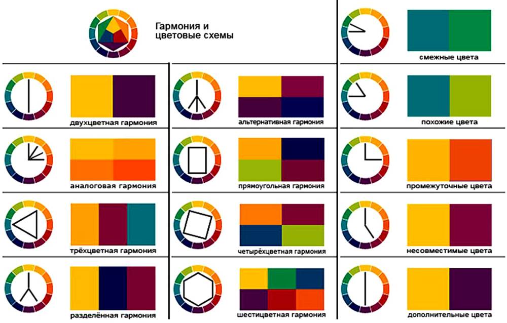
Scheme options
Color palette of color combinations: options for interesting combinations
The table allows you to identify what color combinations can be used in the interior. Photos of the original methods are presented on the site. Particular attention should be paid to the relationship between coloring components and shades.
Next, we will consider interesting ideas for color design for rooms for different purposes.
An original combination of shades
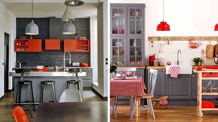
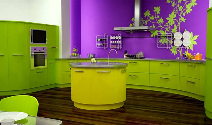
The combination of colors in the interior of the kitchen: photos of stylish ideas
In the kitchen area, by the way, there will be rich, deep and colorful shades. An interesting option is the yellow-blue palette in a nautical style. The cold scale relaxes, reduces appetite and gives freshness. And the warm color palette stimulates the digestive systems, increases appetite and invigorates.
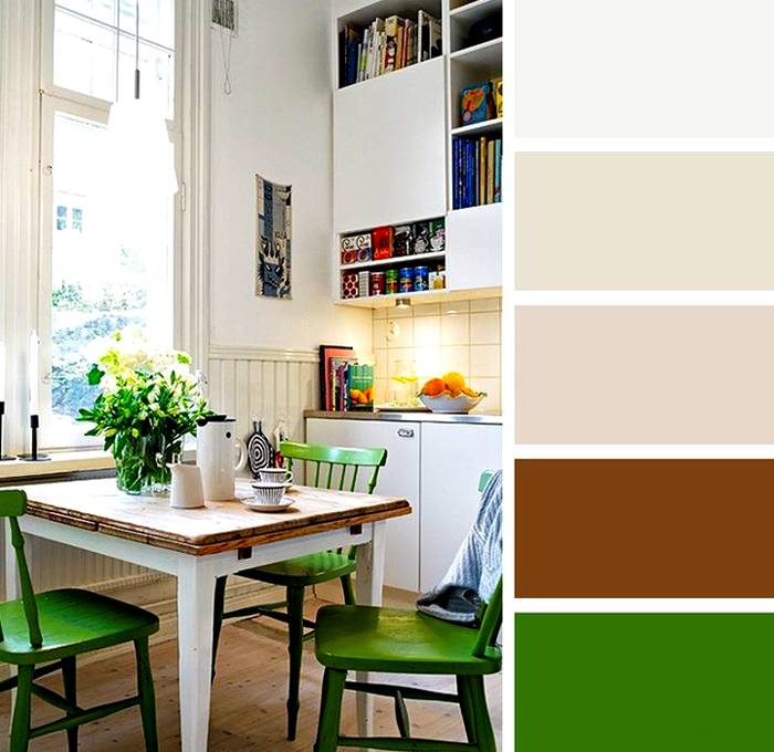
Application of the palette in for kitchen decor
When choosing a palette for the kitchen, achromatic interiors are rarely used. It is gray, white and black. This option can be smoothed out with a juicy accent.
So you can dilute the gray decor
In chromatic designs, the palette is a combination of several shades. First you need to figure out the base tone, and then think about the appropriate environment for the shades. For the kitchen, you can offer the following options:
Contrasting combination in the kitchen interior
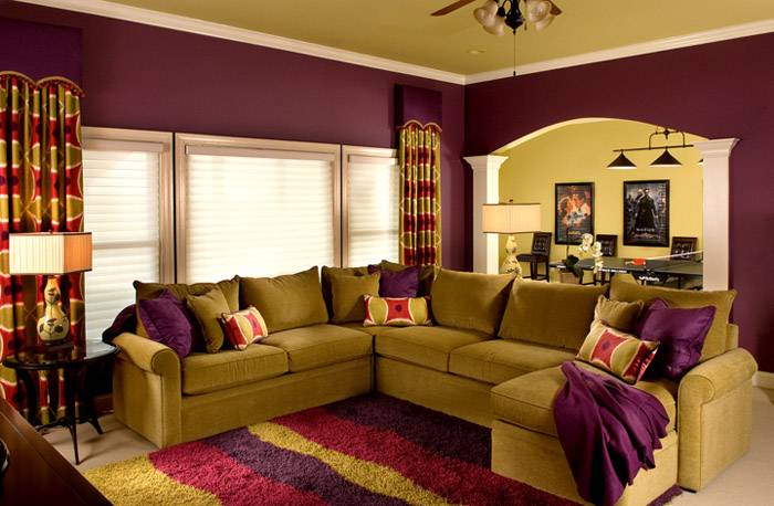
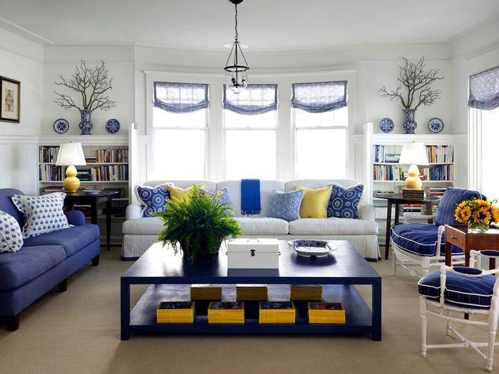
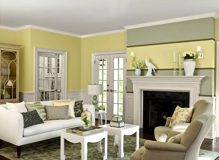
Harmonious color combination in the living room
The colors for the living room are chosen taking into account the preferences of the owner of the room. The main thing is to observe a harmonious combination of colors.
The use of white in interior decoration
Preference should be given to those design options that correspond to certain parameters:
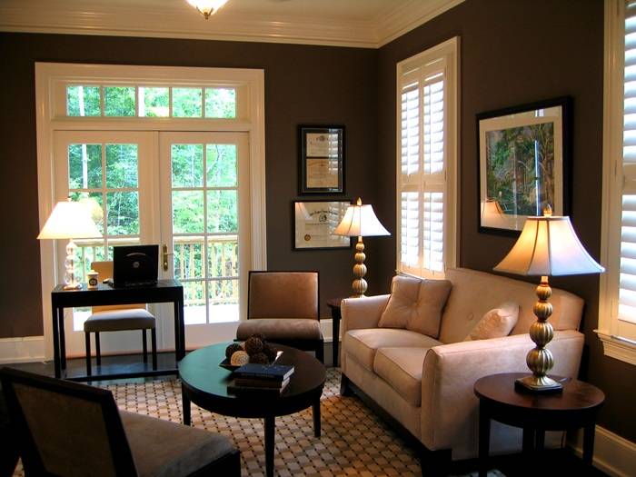
Monochrome design
Smart use of three colors
A room in a vanilla color palette
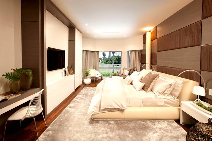
What color palette would suit the bedroom?
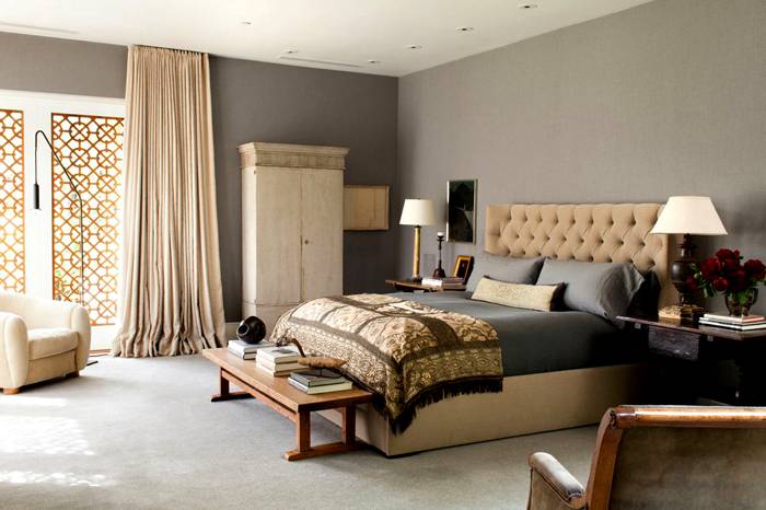
Working on color combinations in bedroom interior, keep in mind that you cannot use more than seven shades. The best option is to choose two basic shades, for example, for the floor and walls, and all other objects are selected by tone, but can be darker or lighter.You can choose a classic design for your bedroom. In this case, coffee, beige and milky tones are used.
Bedroom in beige tones
For style loft terracotta, white and gray shades are suitable. For a Mediterranean-style bedroom, turquoise, blue, sand and yellow shades are suitable. Provence style involves the use of pink, green, blue and gray shades.
Applying brown-beige tones
Colorful decor for the nursery
When decorating a children's room, you can apply the following interesting ideas:
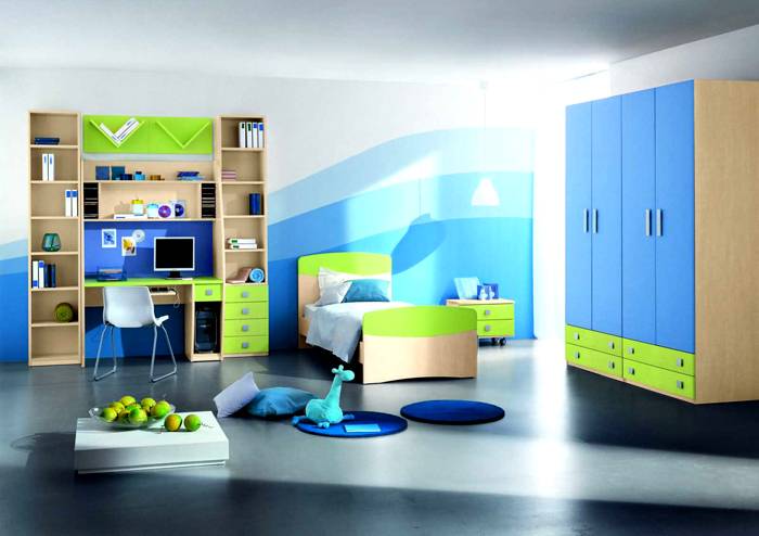
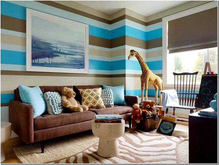
A similar combination is more suitable for a boys' room.
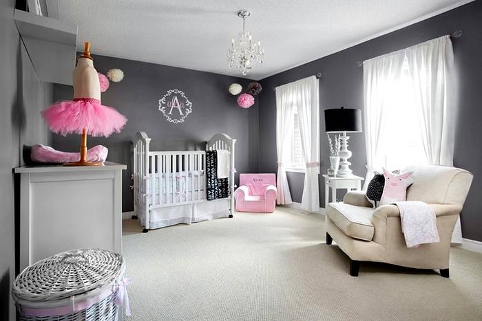
Pink and gray color palette for girls
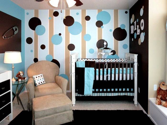
Blue - brown combination
We hope that our article will help you create a unique and stylish interior that will create an atmosphere of coziness and comfort. Importantly, you don't need to be a professional designer for this.
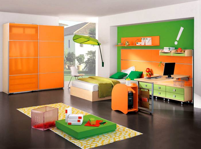
Bright decoration of the children's room
Video: table of color combinations in the interior


See also:
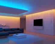 Diagram of connecting a 220V LED strip to the network: how to do it correctly?
 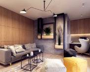 Are you planning a renovation? The interiors of the apartment are simple and tasteful, photos, recommendations
 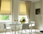 Beautiful Roman blinds on plastic windows: photos of interesting design solutions
 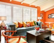 Terracotta color: photo in the interior, color options and fashion accessories
 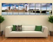 An important touch in design: choosing posters and paintings for the interior
 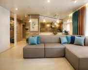 Subtleties of design or how to turn a two-room apartment into a stronghold of comfort, beauty and coziness


